Friday 2 May 2014
Monday 7 April 2014
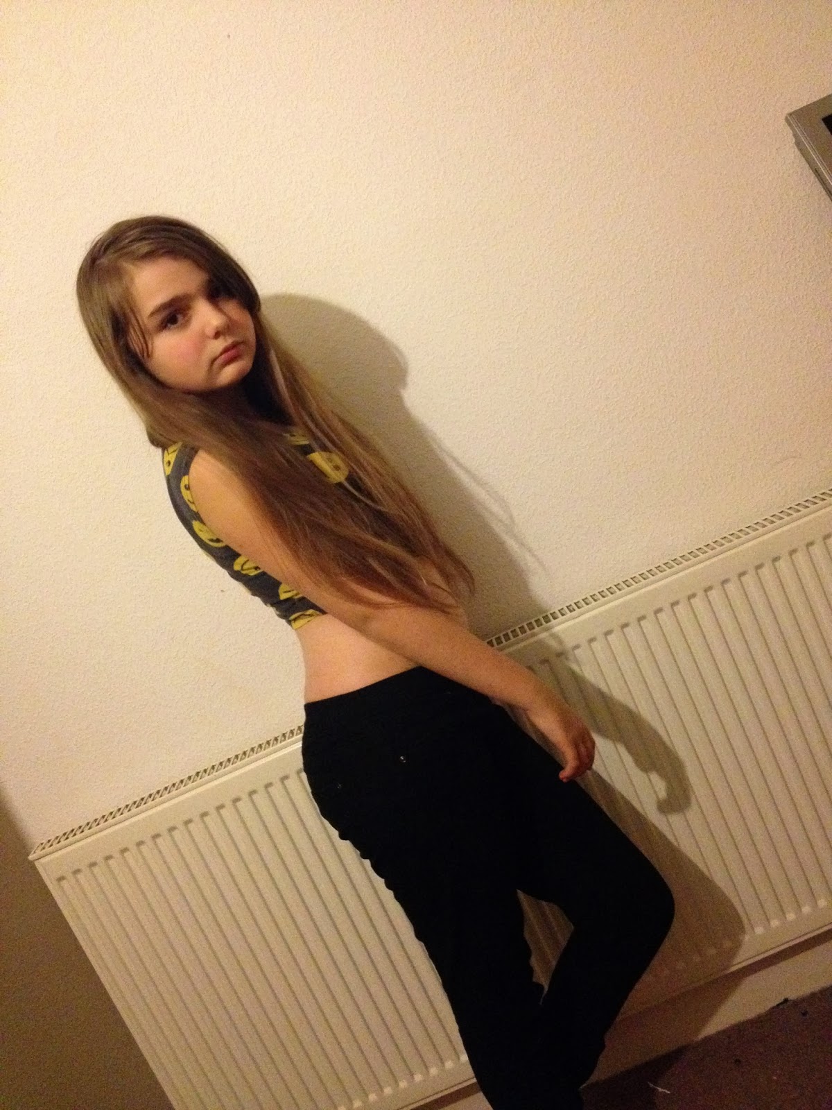
Friday 4 April 2014


Wednesday 26 February 2014
Rethink! Organisation, Planning
After my photography session with my sister (my model) I have come to the conclusion that I may have to rethink about the name of my magazine.
The genre of magazine, vocal pop (straying away from mainstream cheesy pop) but a the look my sister is portraying is different to that of typical vocalists (Christina Aguilera, Beyoncé, Mariah Carey) I may have to think of a new title so that all my stuff to do with research, drafting and planning and organisation won't fit in with my appearance.
My final decisions will be made next week once I've thought of a better name!
Monday 10 February 2014
.jpg)
.jpg)
.jpg)
.jpg)
.JPG)
.jpg)
.jpg)
.jpg)
.jpg)
.jpg)
.jpg)
.jpg)
.JPG)
.JPG)
.jpg)
.jpg)


Friday 7 February 2014
ORGANISATION - Plan For The Photoshoot
My Sister
- I will set up my sister's house to be quite bright and well-lit, (hopefully the sun is shining) and the sun will shine through creating shadows in the right places.
- Blocking of objects around her will be unique, stylish and very chic.
- In her bedroom, the arrangement of the bed will be parallel to the window, for the drapes of the curtains to hang low, and the sheets on the bed to be around her, in a sensual, dramatic way.
- The wallpaper on one wall, is completely white, and will create a good backdrop for the sun to shine on (or artificial lighting) creating a good glare for the camera to take.
- The lighting will play a huge part in this, as if the sun isn't shining then artificial lighting will need to be used to create a good sense of shadowing and effect on the mood of my sister and the photographs.
Friday 17 January 2014
Colour Scheme - Drafting & Planning & Research My Layout
I have tried to incorporate a FEW colours into my magazine design that will enforce the look I wish to convey, but also make it stylish and fun to read. I wanted to use black text like every conventional magazine, maybe a sultry hue of red (Hex Colour #DC1427) added to parts of my magazine.
On my first draft using the programme 'PagePlus' I used superstar Christina Aguilera to appear on my magazine. In my real magazine, I will use artist 'Monika' as my issue star, and elements of my Christina draft magazine will foreshadow my new magazine, incorporating the same headlines, cover headlines, text and colour schemes.
Some colour schemes I looked at for my REAL magazine included:
 Black, White and Purple were good choices as black and white are good contrasts in all paper forms of media, and a magazine specifically would benefit from having a bright contrast which is neutral in gender such as Purple. A dark purple (maybe darker than the one on the image, left)
Also, I decided that Purple would be a good way to make text stand out in quite masculine pages, but there's a feminine touch to purple which would highlight the purity of a female star on certain pages in the issue.
 Here, I decided that maybe I would have a female cover star, but a dominantly male issue inside to create a good gender contrast. But after hours and hours of contemplating my decisions, I considered that maybe a more female magazine would be efficient as my magazine focuses on the music made by powerhouse vocalists, and not many of them are men. Plus, my primary results showed that it's mostly females that are interested in my magazine, so yet again, I had to change my mind.
THIS IS THE ONE! Not too pink, not too red. The hex:colour I've chosen above is #DC1427 (which is slightly different to the image, left)
However, I know that this sultry hue of fuchsia will adhere to my magazine as it fits precisely with the magazine attitudes, the attitudes of the cover stars, the personality of the issue stars, photography, typography and matches the overall look of the enterprise.
Also, I decided that Purple would be a good way to make text stand out in quite masculine pages, but there's a feminine touch to purple which would highlight the purity of a female star on certain pages in the issue.
 |
| Add caption |
However, I know that this sultry hue of fuchsia will adhere to my magazine as it fits precisely with the magazine attitudes, the attitudes of the cover stars, the personality of the issue stars, photography, typography and matches the overall look of the enterprise.
Subscribe to:
Posts (Atom)